



It's been more than a year since our Jeopardy! benchmarking series (Round 1, 2, 3, and 4). While trivia questions were fun, they are not representative of our day-to-day work. So in this new round of benchmarking, we jump right into data analysis.
However, it can be tricky to construct the test dataset. Foundational models are trained on the internet, so taking an existing dataset has the risk of the models having "seen the answers". For this reason, our test dataset is simulated, based on a very common scenario.
The Test Dataset
Imagine an online store that wants to redesign its product landing page. The team comes up with seven new versions, variants B through H, and tests them against the current page, variant A. Every visitor is randomly assigned to one version and stays on it for the whole test. We log what happens: did they click the call-to-action, did they add something to the cart, did they buy. Ten weeks of daily counts, eight versions, 560 rows in total.
This full dataset is small enough to include into a prompt, and it looks like the kind of table most of us have analyzed at work. By tuning the parameters for each scenario, variants were set up to be statistically distinct - some more performant, and some have interesting behaviors.
The Prompt
Each model receives the identical prompt with the dataset baked in. We provide the background of the analysis task, how the data was gathered, and request the model to generate an analysis report as a standalone HTML file and return nothing else. We then use OpenRouter to try different models. No additional tool or model parameter setting - every API call was made in exactly the same way.
You are a data analyst at an online retailer. The product team ran an experiment on the site's main product landing page and needs a report on the results.

## Background

Over ten weeks (2026-06-01 to 2026-08-09) we tested eight versions of the product landing page, labelled A through H. Every visitor who reached the page during the experiment was randomly assigned to one of the eight versions, in equal proportions, and stayed on that version for the whole period. Version A is the current page; B through H are candidate redesigns that change layout, copy and the primary call-to-action.

We logged what visitors did after landing, aggregated per day and per version:

| column        | meaning                                                                 |
|---------------|-------------------------------------------------------------------------|
| `date`        | calendar day                                                            |
| `variant`     | which version of the page the visitors saw (A–H)                        |
| `visitors`    | number of visitors assigned to that version on that day                 |
| `clicks`      | of those visitors, how many clicked the primary call-to-action          |
| `add_to_cart` | of those who clicked, how many added an item to their cart              |
| `purchases`   | of those who added to cart, how many completed a purchase               |

The team's goal is to decide what to do with the page next. They are not statisticians; they want to understand what actually happened in the experiment and what it means.

## Your task

Analyze the data below and produce a report, as a single self-contained HTML file with charts, that communicates what matters to the product team.

Requirements for the output:

- Return only the HTML document, starting with `<!DOCTYPE html>`. No explanation before or after it, and no markdown code fences (no ```html): the response will be saved to a file and opened in a browser exactly as returned.
- The file must render on its own when opened in a browser. Inline all CSS and JavaScript. You may load a charting library from a public CDN via a `<script>` tag, but do not fetch any data from the network; embed whatever data the charts need in the file.
- Do not use images or external assets.

## The data

```csv
date,variant,visitors,clicks,add_to_cart,purchases
2026-06-01,A,3407,1202,205,74
2026-06-01,B,3394,1166,192,68
2026-06-01,C,3510,1760,298,68
2026-06-01,D,3519,1262,209,66
2026-06-01,E,3377,1050,167,62
2026-06-01,F,3350,1269,222,71
2026-06-01,G,3301,1130,195,66
2026-06-01,H,3325,1156,179,52
<rest of data omitted>
```
Scoring
For each model, we scored it on six different criteria:
- Speed: How long the API call took.
- Cost: What OpenRouter charged for the API call.
- Correctness: Did the report find the insights planted in the simulated data? Did the model make any wrong claims?
- Narrative: Is the model a good storyteller? Does the report lead with the key finding, tell the team what they need to know without noise, back up its claims, and say what it means without hedging?
- Data visualization approach: Did the model pick the right plotting type for the point it tries to make? How about chart hygiene like, axes labels, honest baselines, tick sizes, and confidence intervals when helpful?
- Visual appeal: Is it nice to look at? Is there a wow factor? Does it feel polished?
Models
We picked a mix of flagship and budget models from six major providers. Most of the models were able to return a full HTML report - each report has a link so you can check it out on your own!
| Provider | Model | Time | Cost | Report |
|---|---|---|---|---|
| Anthropic | Claude Opus 5.5 | 4:41 | $0.69 | Open report ↗ |
| Claude Sonnet 5 | 8:42 | $0.64 | Open report ↗ page renders blank: a script error stops the report from loading | |
| Claude Opus 5 | 11:09 | $1.58 | Open report ↗ | |
| OpenAI | GPT-6 Luna | 1:09 | $0.01 | Open report ↗ |
| GPT-6 Luna Pro | 1:21 | $0.01 | Open report ↗ | |
| GPT-6 Sol Pro | 1:54 | $0.29 | Open report ↗ page renders blank: a script error stops the results from loading | |
| GPT-6 Astra | 3:25 | $0.91 | Open report ↗ | |
| Gemini 3.7 Flash | 0:54 | $0.05 | Open report ↗ | |
| Gemini 3.1 Pro | 2:34 | $0.34 | Open report ↗ | |
| Gemini 3.8 Flash | 3:14 | $0.13 | Open report ↗ | |
| DeepSeek | DeepSeek V4 Pro | 1:52 | $0.03 | Open report ↗ shown with a preamble and code fences removed by hand; the model did not return HTML only |
| DeepSeek V4.1 Flash | 4:56 | $0.01 | Open report ↗ | |
| Qwen | Qwen 3.8 Max Prime | 10:07 | $0.84 | Open report ↗ renders, but every number shows as NaN due to a script bug |
| Qwen 3.8 Omni Flash | 17:05 | $0.00 | No report: call timed out while reasoning | |
| Z.ai | GLM 5.3 Prime | 7:17 | $0.61 | No report: cut off while reasoning |
| GLM 5.3 FlashX | 7:22 | $0.09 | No report: cut off while reasoning |
Highlights
Before jumping into the scoring results, here are some observations worth mentioning.
- Model benchmarking has become easy-breezy with OpenRouter. Previously, I had to get DeepSeek hosted on AWS Bedrock - quite feasible but it took some time to set up. I also had several python clients to interact with different model providers. Fast forward one year later, trying out more than a dozen model can now be done with just one API key, with the same python code.
- Even without specifying data analysis tools, like statistical methods, most models are able to perform calculations reasonably. Barring provider failures, nearly all models, including those optimized for speed, can identify which variant is the most performant.
- The analytical findings varied more than the visuals did. Only three models, Claude Opus 5.5, Claude Opus 5 and GPT-6 Astra, picked up every pattern we had built into the data; most of the others caught the main result but missed the subtler ones. One model was drawn to the variant with the highest click-through rate rather than the one that actually sold the most. Three models wrote a perfectly reasonable analysis and then shipped it inside JavaScript that doesn't run, so their pages show empty boxes or NaN. And a few found the right answer, then hedged it into a recommendation for a confirmatory test, on a result that was not close.
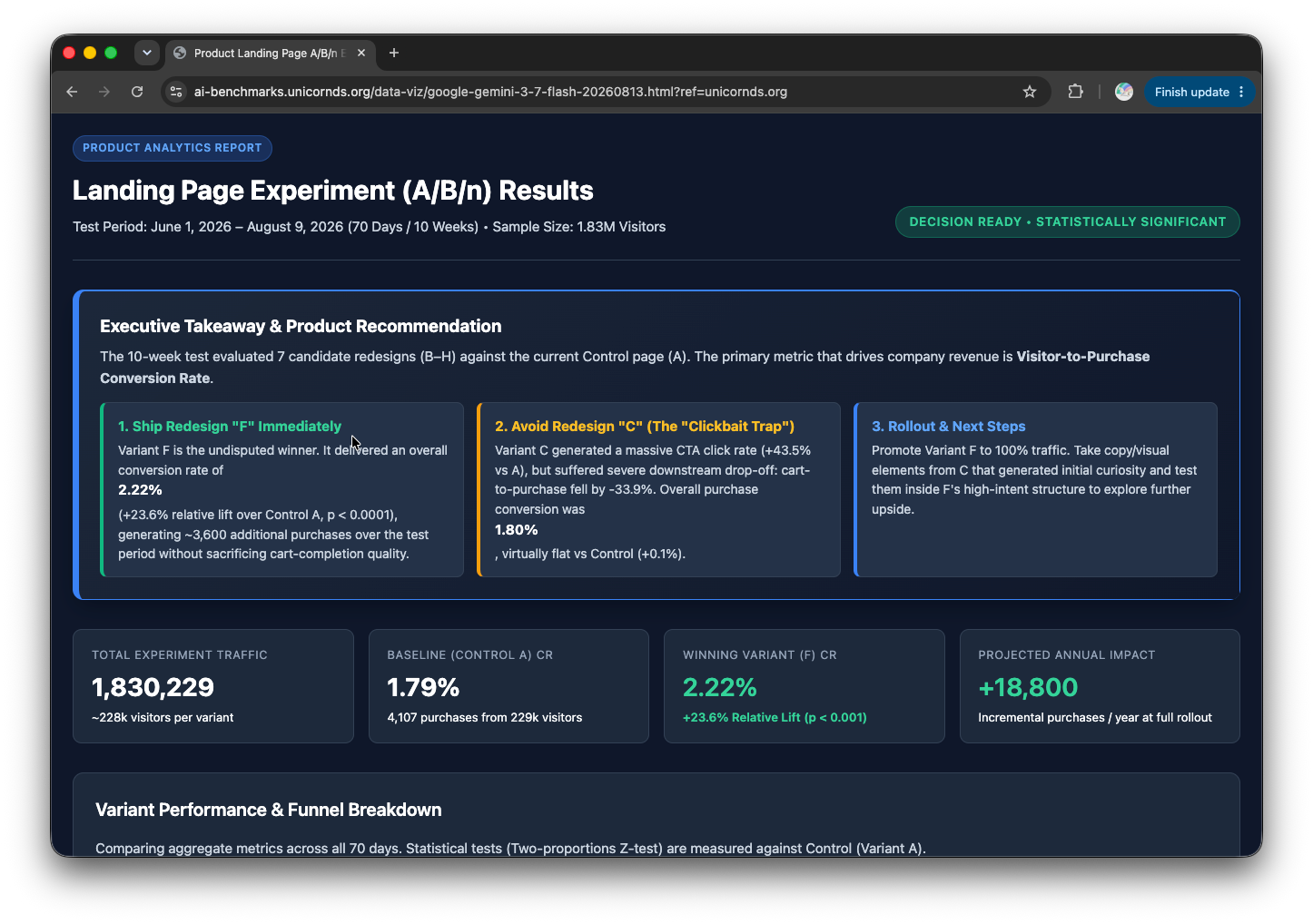
- Google Gemini 3.7 Flash goes dark mode, the only model to make this choice. All other models had the default white background.
- Anthropic Claude Opus 5.5 and Opus 5 have... eerily similar looking reports.
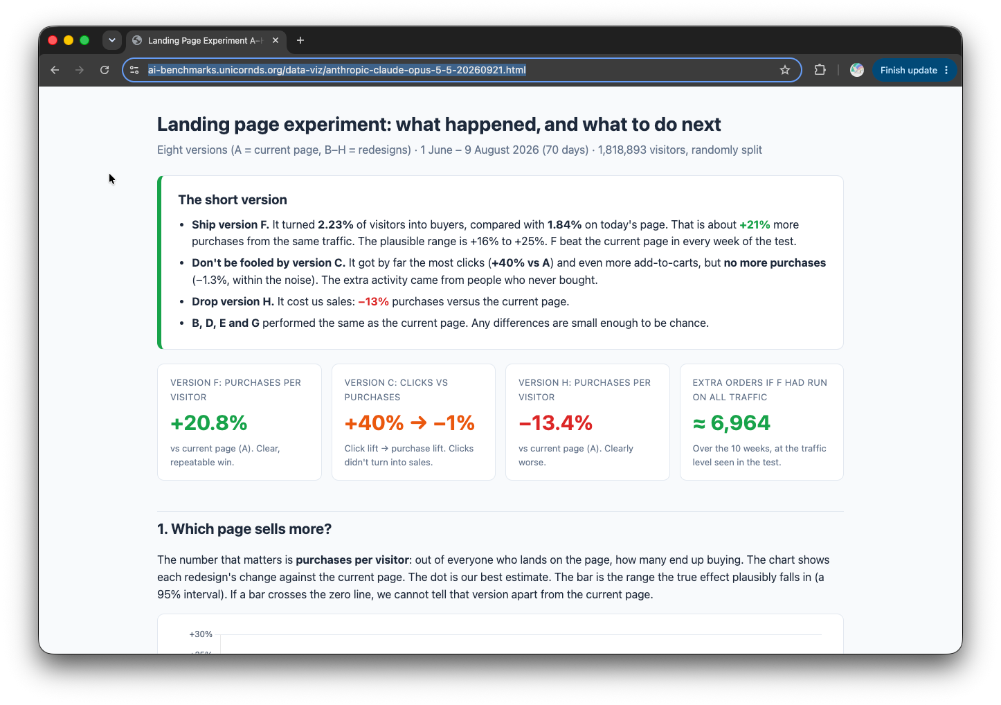
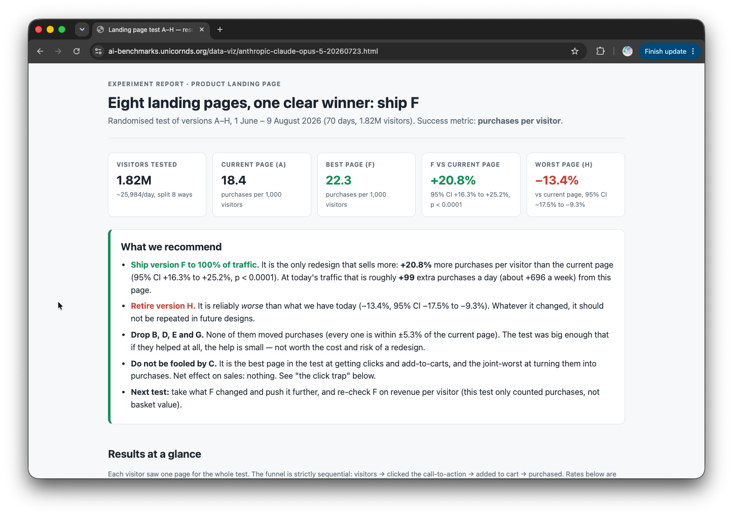
Left: Anthropic Claude Opus 5.5. Right: Anthropic Claude Opus 5. Identical font choices and color themes.
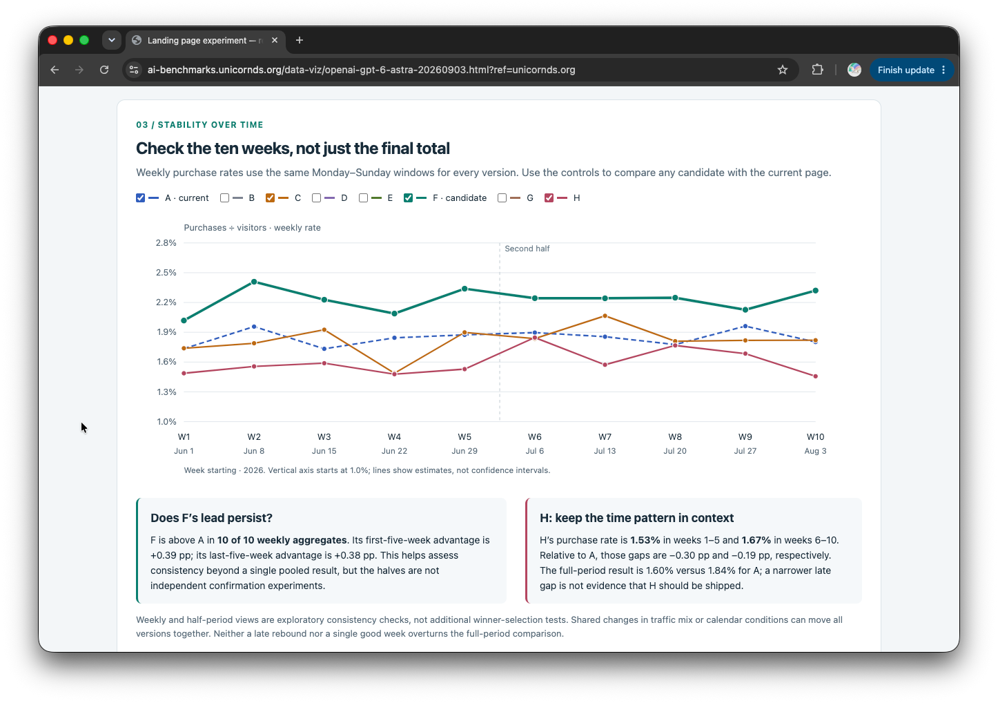
- OpenAI GPT-6 Astra adds some nice interactivity touches like data visualization filtering, and data downloading.
Results
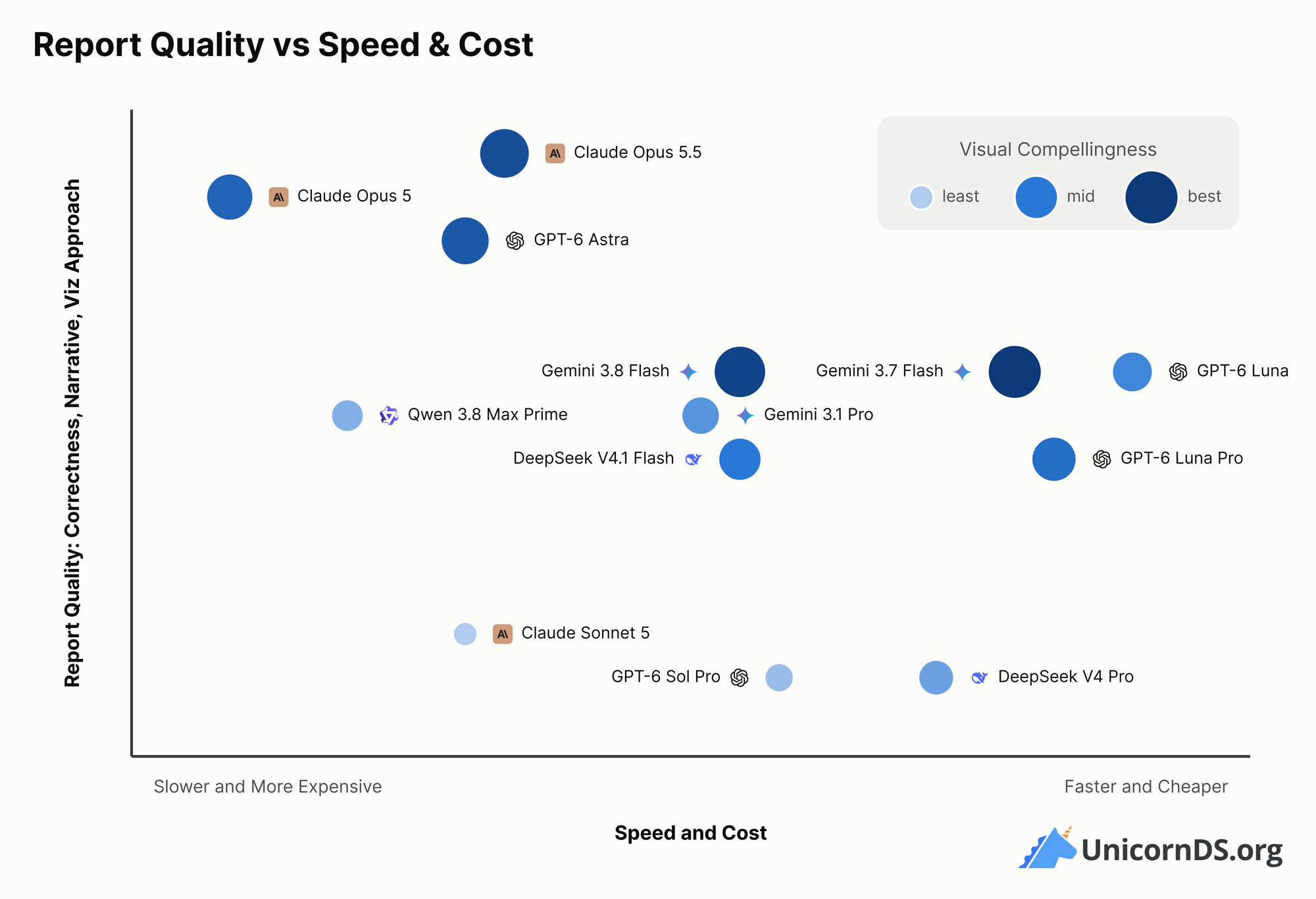
After reviewing each result, and scoring their contents, we arrive at a full scoreboard, which is summarized below.
So which LLM is best for data visualization?
If cost is not an issue, the new Opus 5.5 introduced a week ago is really hard to beat. It scores high on all correctness measures, and tells a solid data story. We didn't find it to be the most visually stunning, but the insights are there. And given Opus 5.5 is faster and cheaper while maintaining the same if not higher report quality compared to Opus 5, there's not really any reason to use Opus 5 anymore.
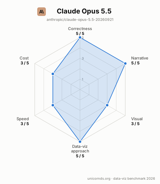
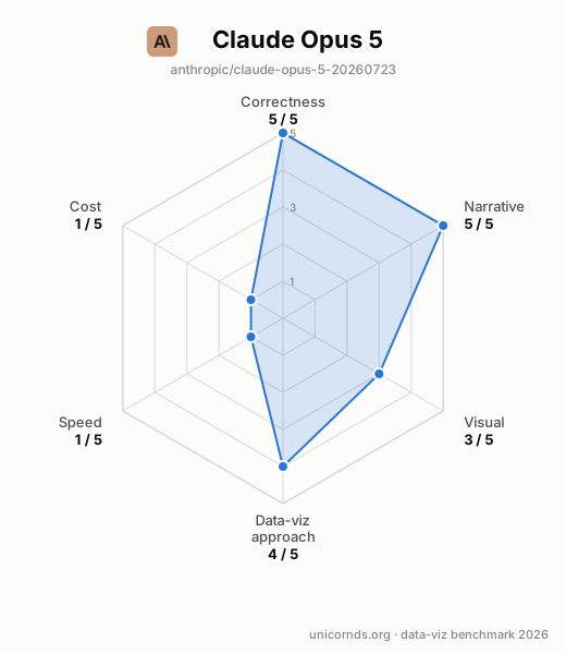
Comparison between Claude Opus 5.5 and Opus 5. Opus 5.5 maintains report quality while being cheaper and faster.
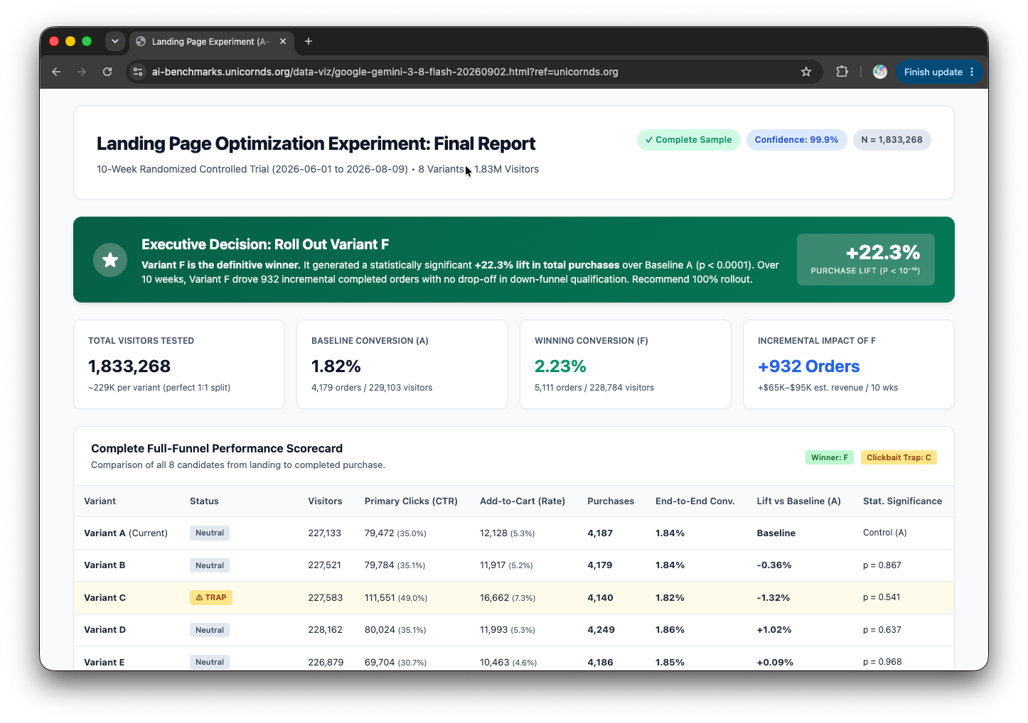
On the other hand, Google's Gemini 3.8 Flash and 3.7 Flash, although released less than a month apart, produced drastically different looking reports. This is unlike Opus 5 versus Opus 5.5 - the two reports shared identical layout. Given the much lower cost of the Google Gemini Flash models, their ability to produce good looking reports can be quite appealing. They are weaker analytically though than, e.g., Opus 5 and 5.5.
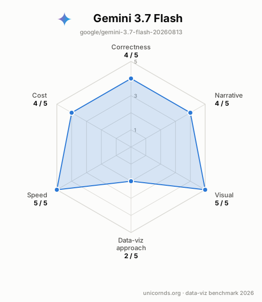
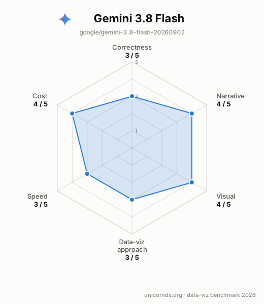
Google Gemini 3.7 Flash and 3.8 Flash.
Another way to balance cost and quality is to leverage the cheapest model of the bunch, OpenAI GPT-6 Luna (each report cost $0.01!), with the analytical thoroughness of GPT-6 Astra.
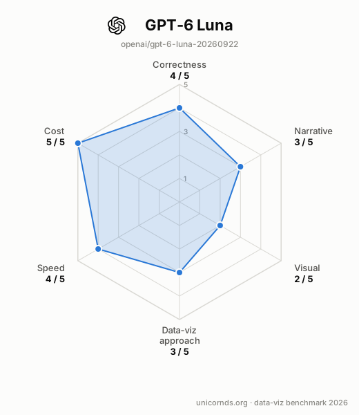
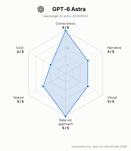
GPT-6 Luna is incredibly cheap ($0.01 per report). GPT-6 Astra is more expensive ($0.91) but its report quality is stronger.
And at least based on this round of benchmark, the Qwen and Z.ai models struggled with the task, mostly by never finishing their reasoning. DeepSeek was a mixed bag: V4 Pro went for the wrong variant, while V4.1 Flash got the main call right for about a cent.
Wrapping up
What impressed us most is how far a single prompt now goes. With no tools and no follow-up, most of these models came back with a report that looks reasonable at first glance. A year ago that took several rounds, and only with the most expensive models.
But none of the reports was perfect (or we were too picky!). Upon closer inspection, we found a script that doesn't run, a number that drifted, an axis that starts at 1%. Careful and thorough inspection, with domain expertise, is still very much needed. A polished-looking report can carry a subtle issue that leads to the wrong decision, and the only way to catch it is to check the work.


